Fieldnote: Visualising Experiment Portfolios
Let's talk about Experimentation Portfolios. Visualising an array of experiments to see active and latent potential to shift systems through living labs, mission-oriented innovation and challenge precincts.


Let's talk about Experimentation Portfolios.
 Sam Rye
That's how the linkedin post started, but obviously this has been an ongoing conversation ever since the rise of portfolio approaches, social labs, deep demonstrations, mission-oriented innovation, challenge precincts and living labs struck on the idea of a 'portfolio of experiments'.
- Nesta, The Experimenter’s Inventory, 2020
Of course Portfolios have existed in innovation, finance, strategy, art and other realms, which are the roots of this idea.
15 (rough) visuals to think about Portfolios
The purpose of this fieldnote is to share a number of different ways we could visualise portfolios, with the aim to spur discussion, surface promising angles to pursue, and perhaps identify existing tools which could deliver some / all of the main views.
Takeaways
I'm going to start with the takeaways rather than the visuals. However, having generated and gone back through the visuals, I've seen a few clear patterns:
Diverse Information
Different visuals are sharing different information, and solving for different information needs - such as seeing / acting on:
- the whole portfolio
- the interconnections - active or latent
- categories - domains, level aimed at, scale up / phase out
- status
- factors - e.g. effort, value, impact, cost, scale etc
- coordination
- place
- detail vs high level
This is a lot of different things to get across, and not everyone will want or need to know everything.
Scaling Up over time
Some visualisations will scale up better than others, as more experiments are identified and activated.
- The challenge for many visuals is that once you go over 30-50 experiments, the visualisation will be overwhelming.
- Effective visualisation might need us to default to a subset of information (e.g. current active experiments, or a single domain) rather than a 'whole of portfolio' view, supported by robust filtering.
Roles
Whilst some visuals could be implemented as interactive elements allowing additional information to pop up (e.g. descriptions, categories etc), it is clear there are a range of roles associated with the portfolio which have different needs:
- Viewer - someone who is browsing and might be looking for specific information, or generalised interest in the portfolio and its interconnections.
- Coordinator / Manager - the people who are actively working with a range of participants to identify, design and track experiments.
- Experiment Lead - the people who are leading the experiments need to submit the findings somewhere, plus might be interested in seeing who else is in the ecosystem who they could collaborate with.
- Knowledge & Learning Activator - at the core of many of these labs, challenges, demonstrations etc which are using Portfolios, is the need to gather findings, make sense and draw connections, produce knowledge materials (synthesis reports, visualisations etc), and activate knowledge across the experiments. Thus being able to capture the experiments, link to their findings, and then connect people to this knowledge over time is vital.
The Visuals
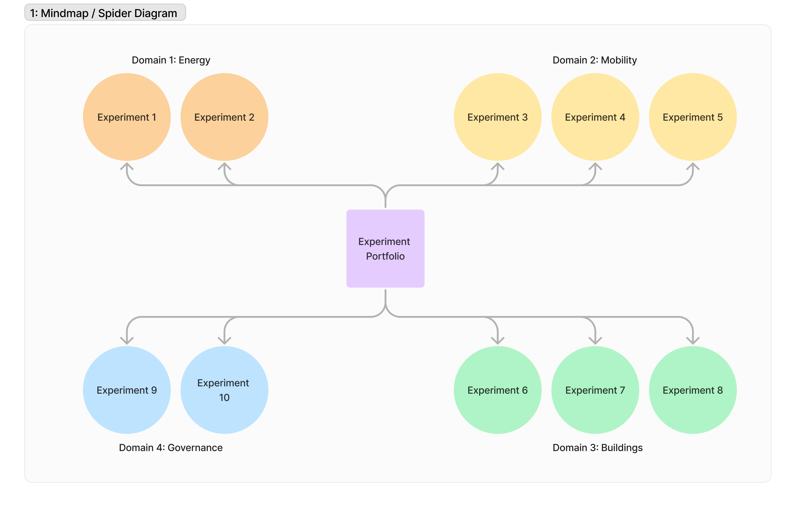
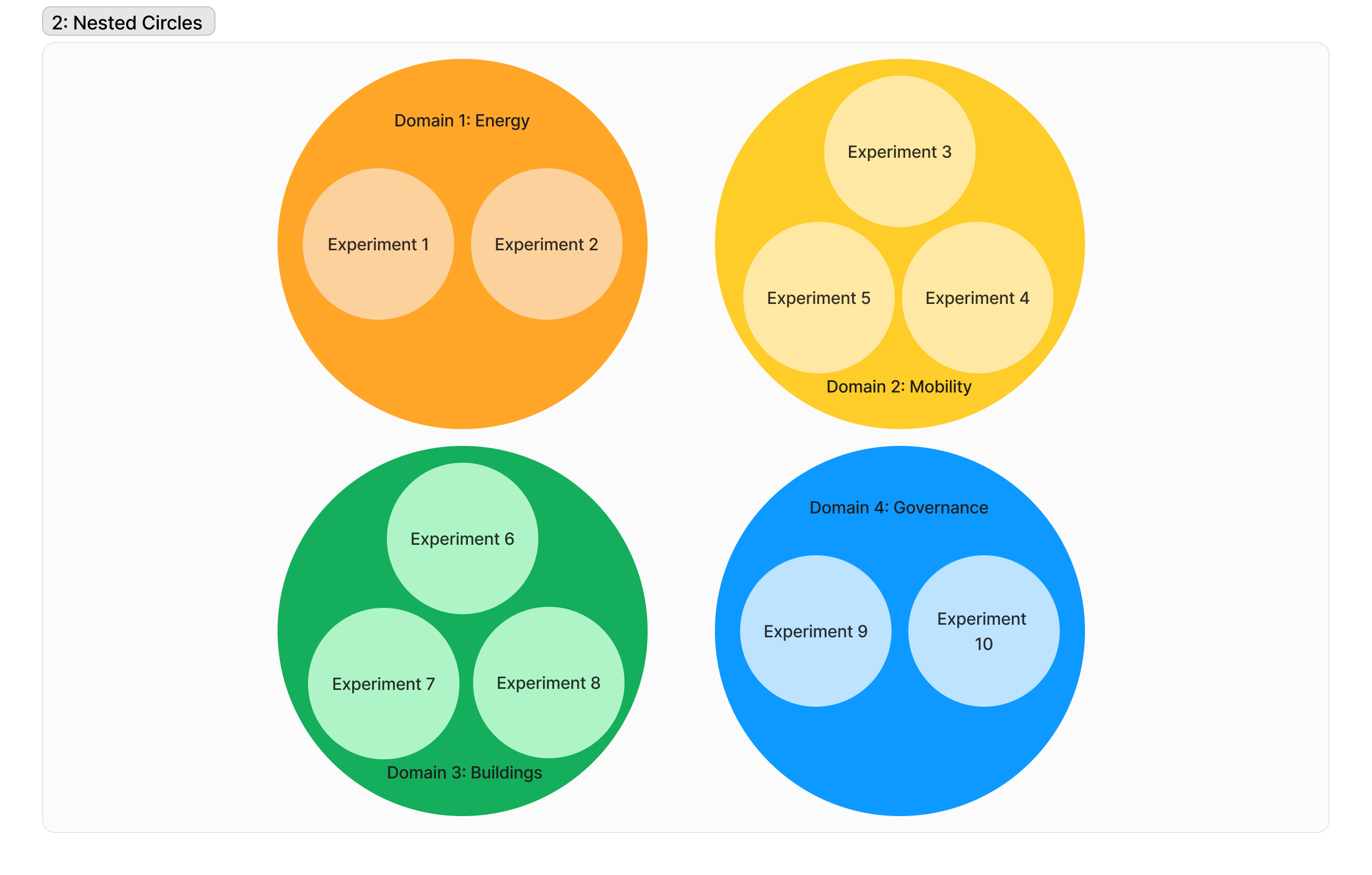
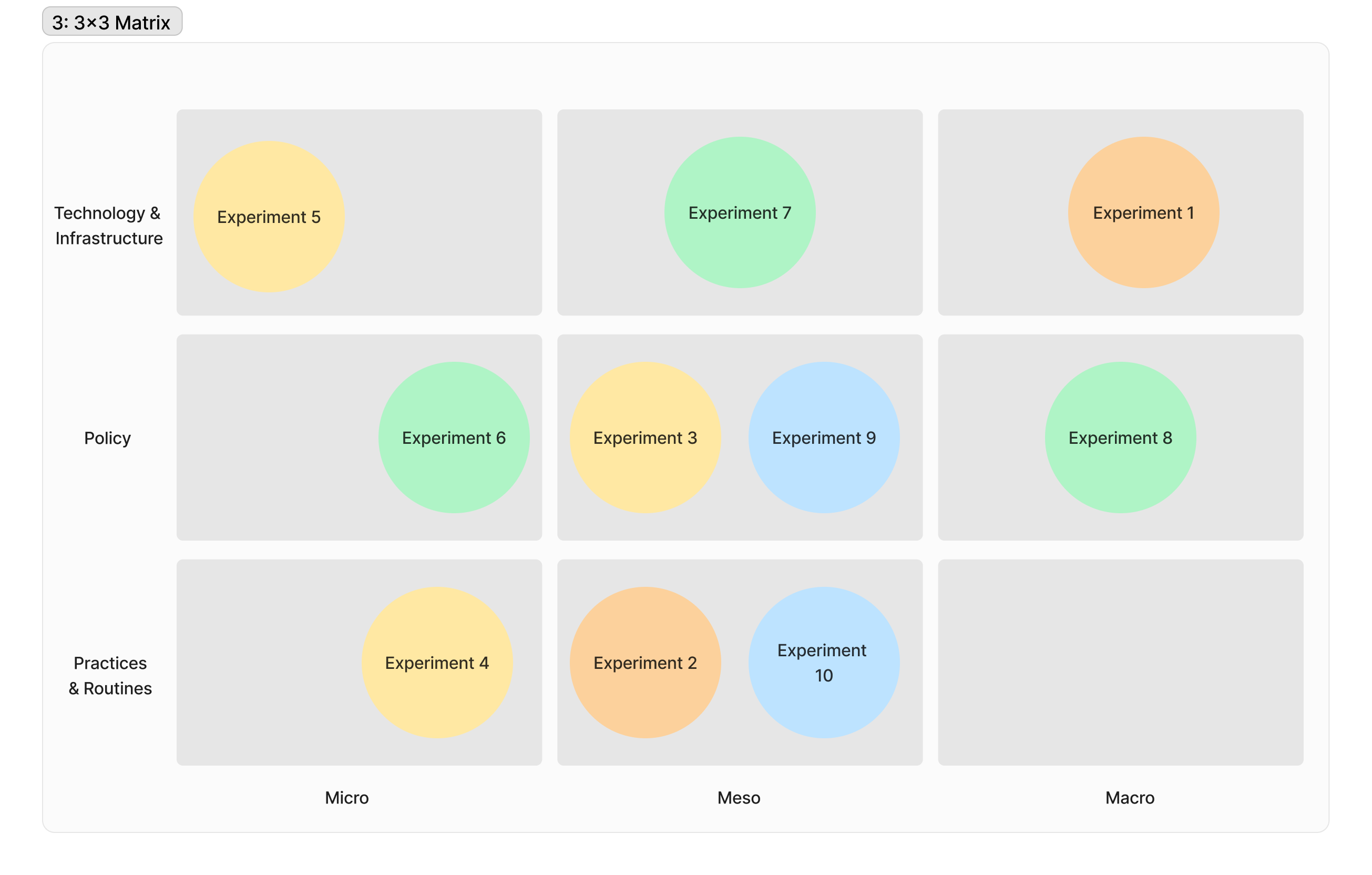
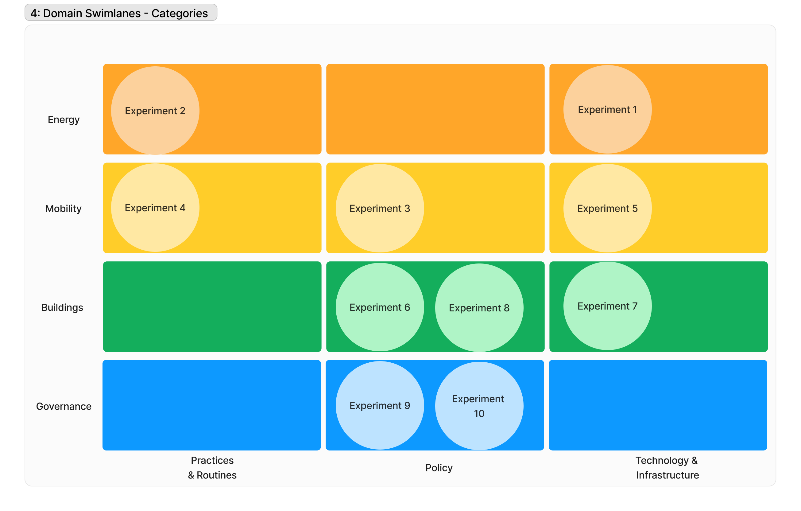
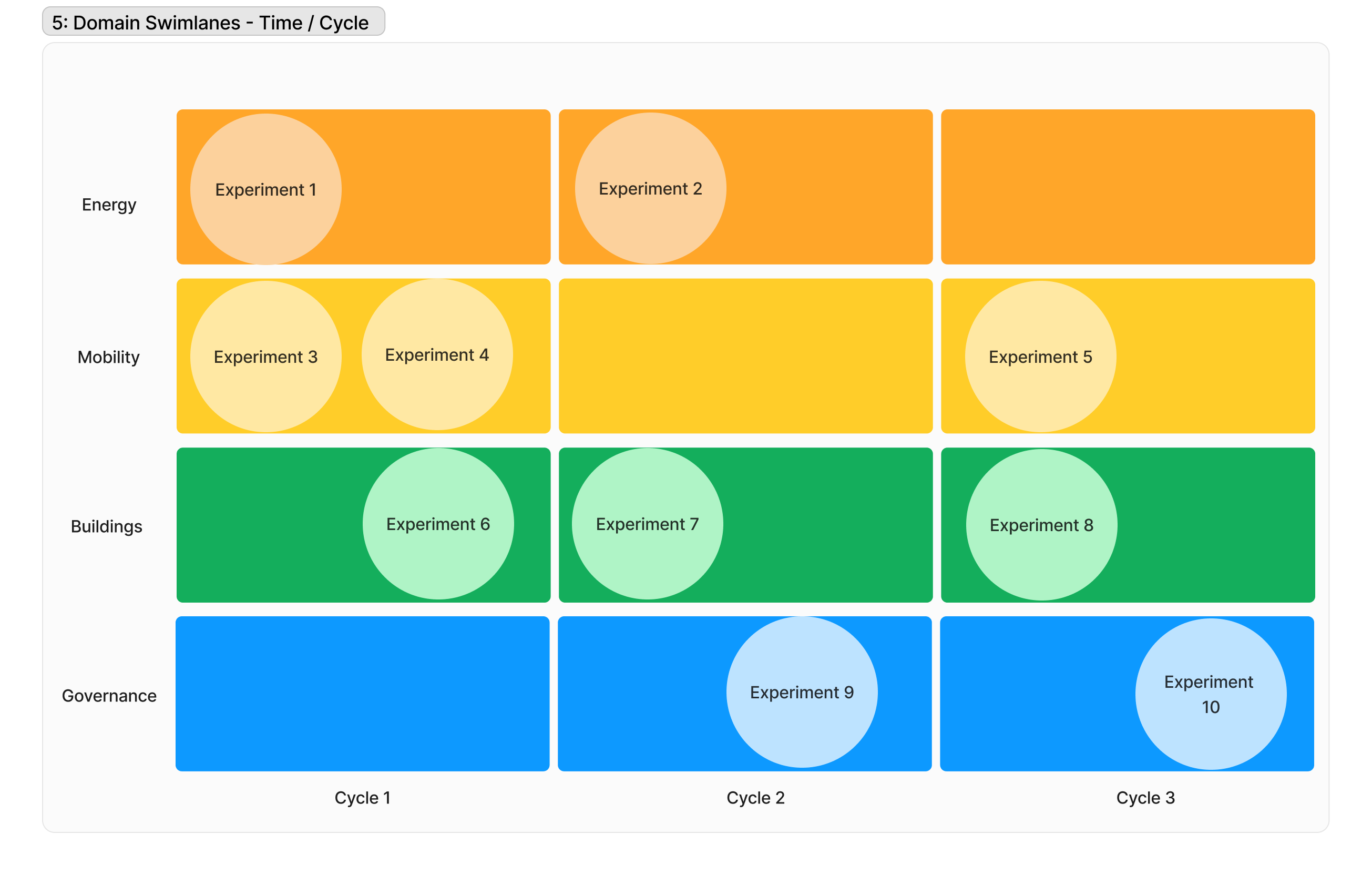
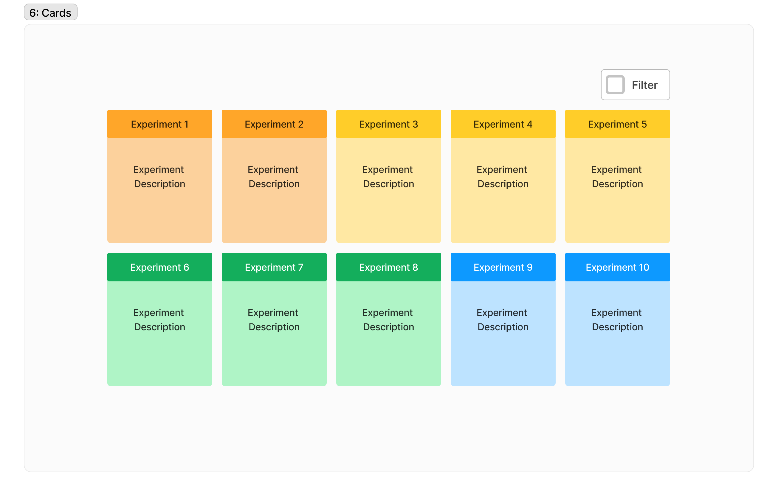
Here are the exploration of basic visualisations of a notional Net Zero portfolio of 10 experiments which belong to 4 domains (energy, mobility, buildings, governance).
1: Mindmap / Spider diagram
2: Nested Circles
3: Matrix 3x3
4 & 5: Swimlanes - Domain x Categories & Domain x Lab Cycle
6: Cards with Filter
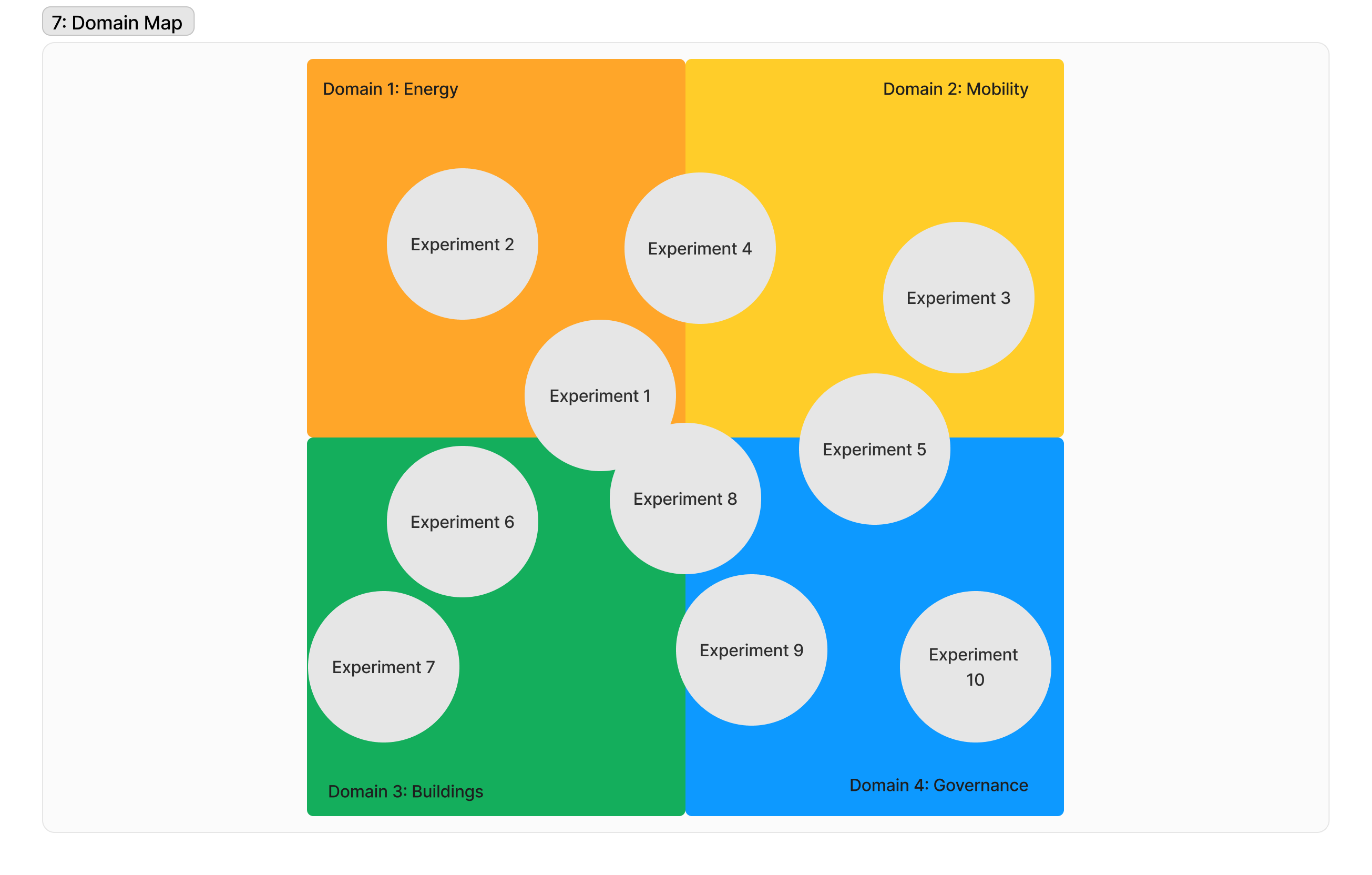
7: Domain Map
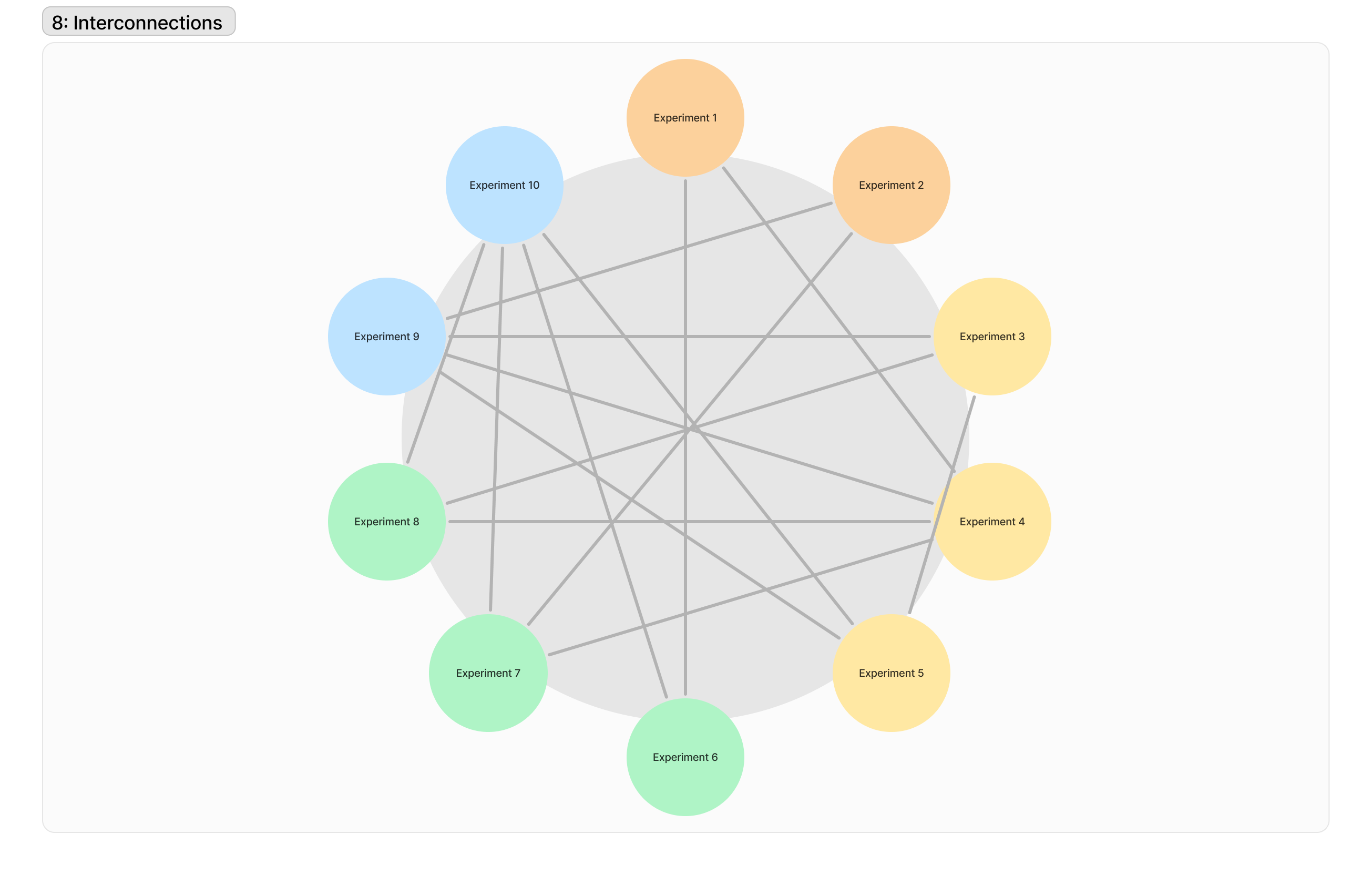
8: Interconnection Circle
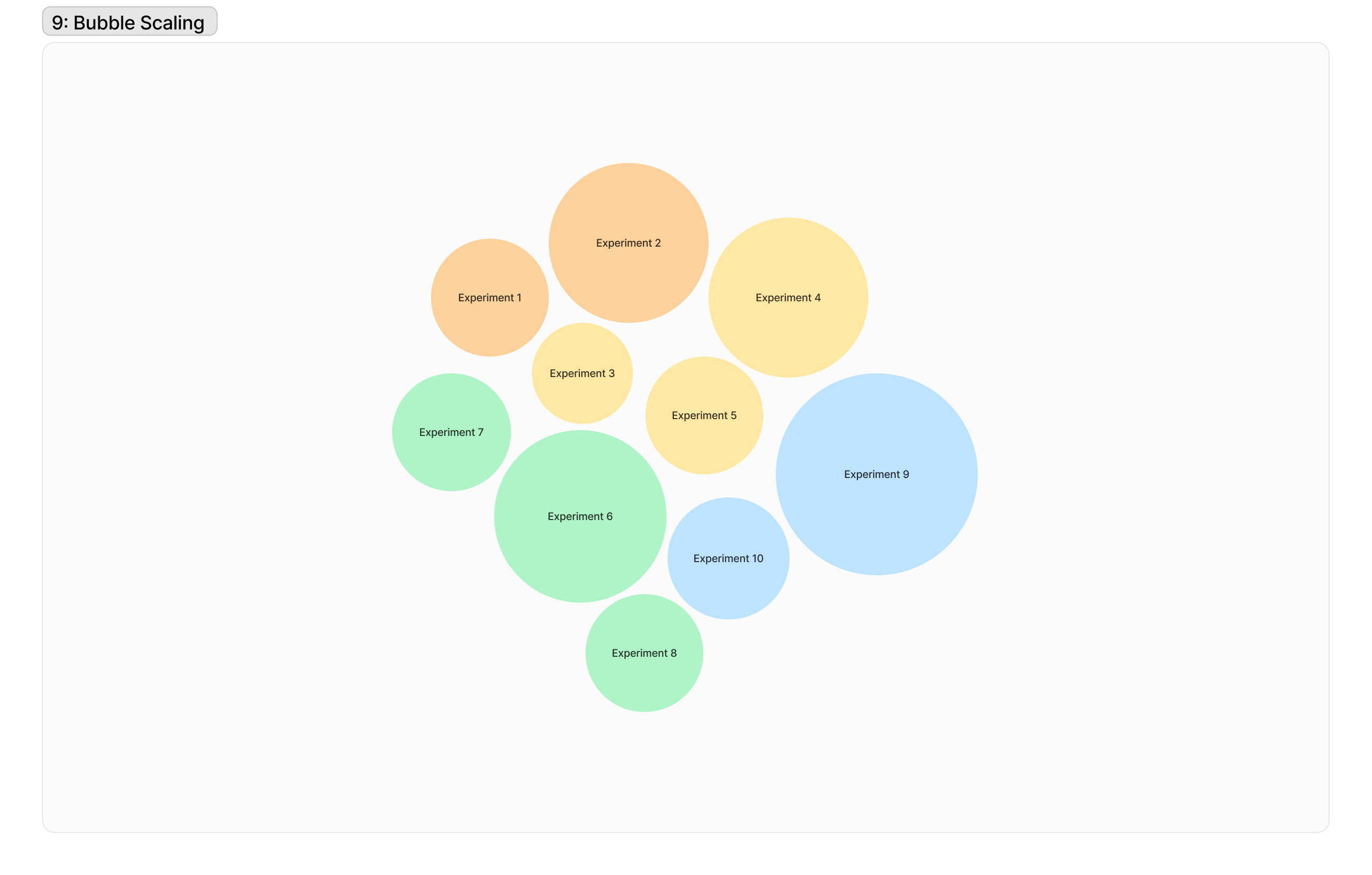
9: Bubble Scale
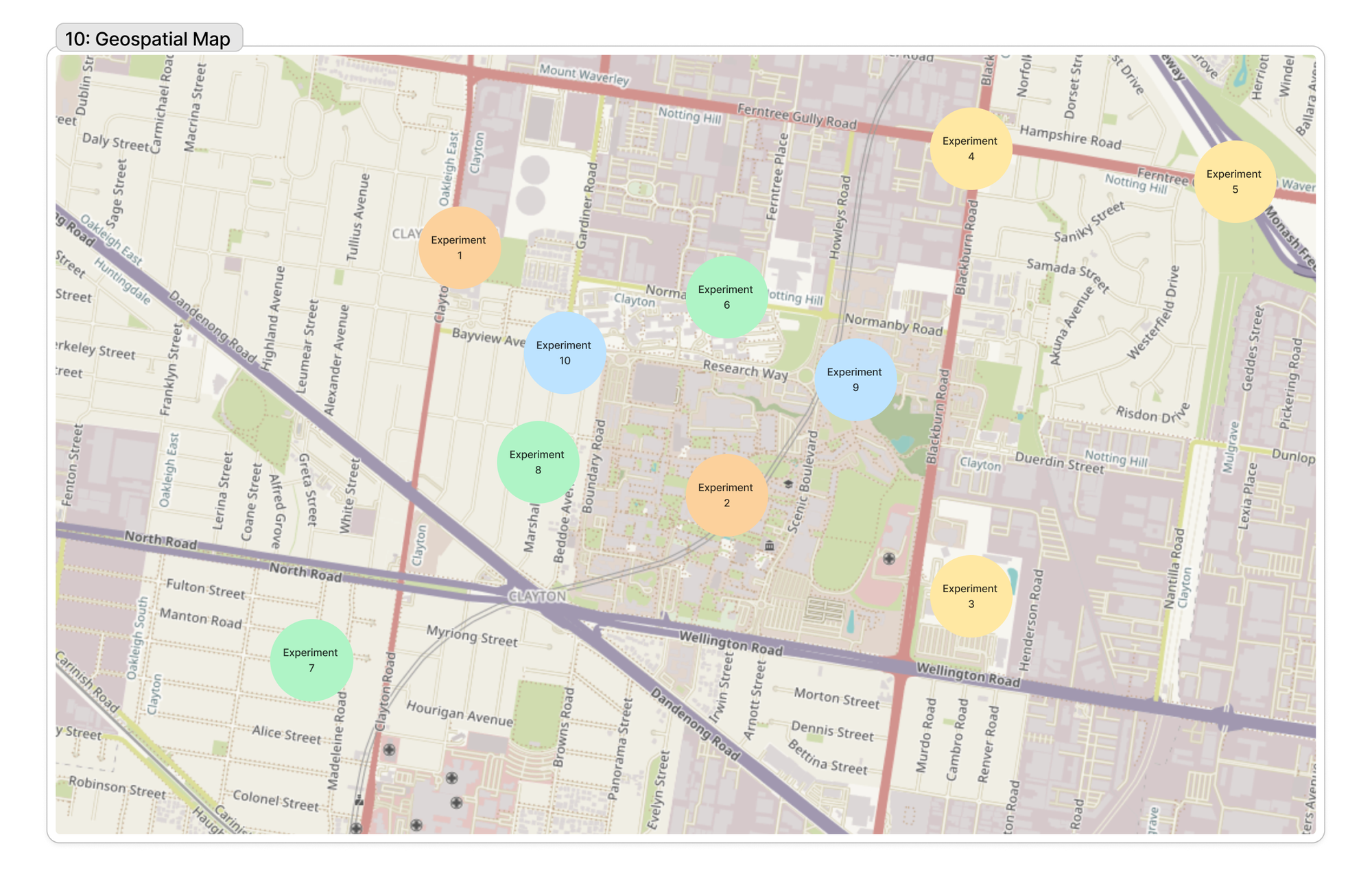
10: Geospatial Map
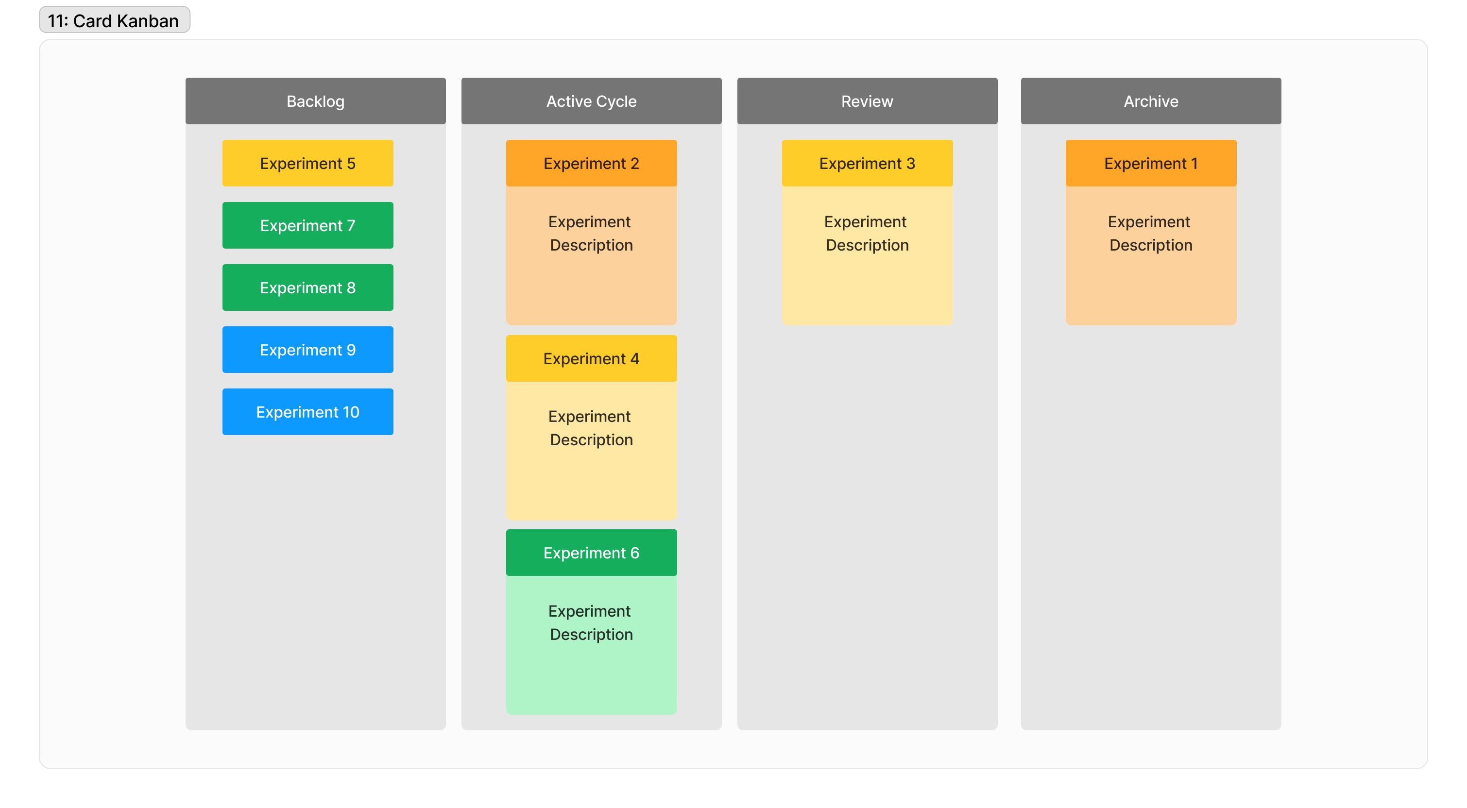
11: Kanban Cards
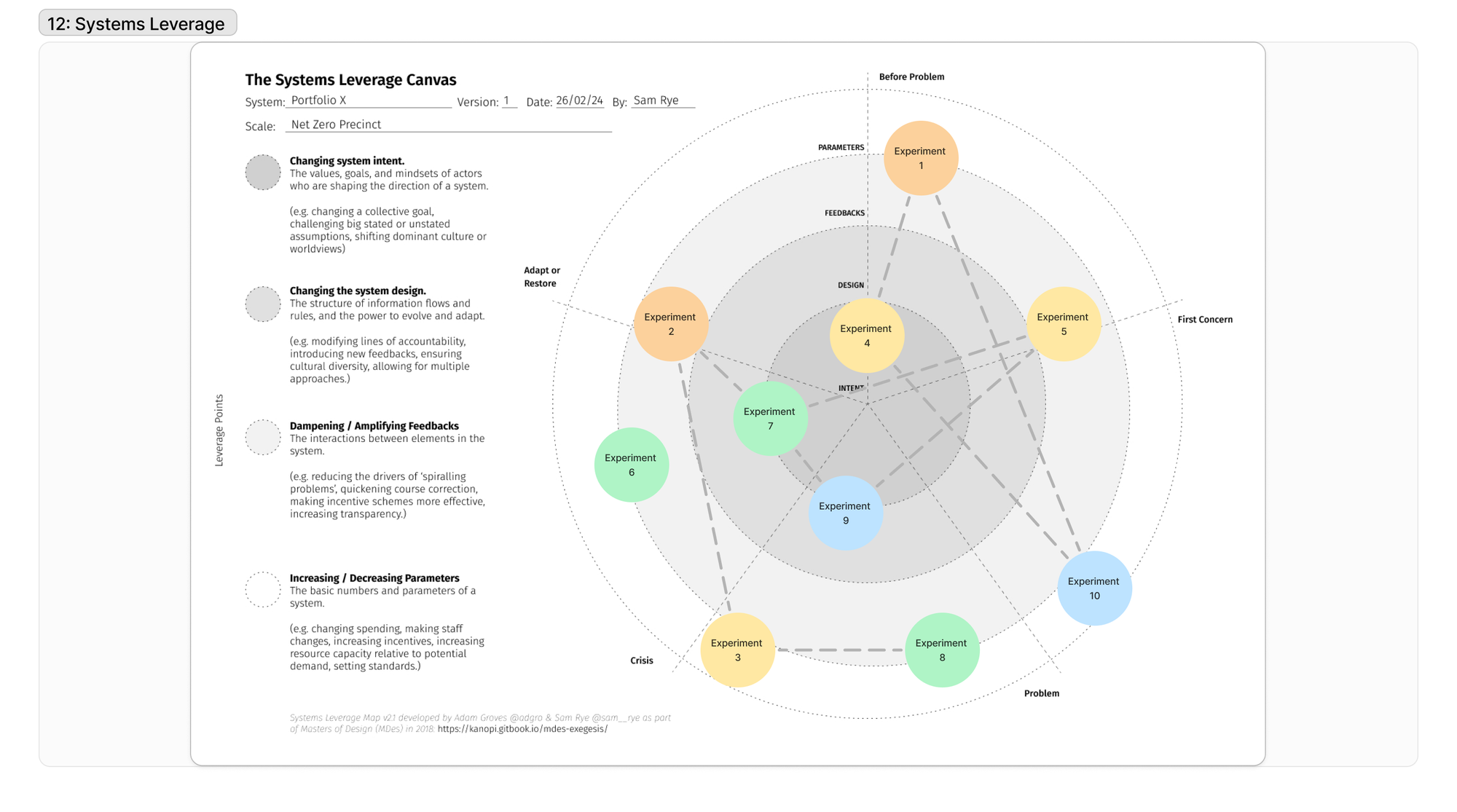
12: Systems Leverage
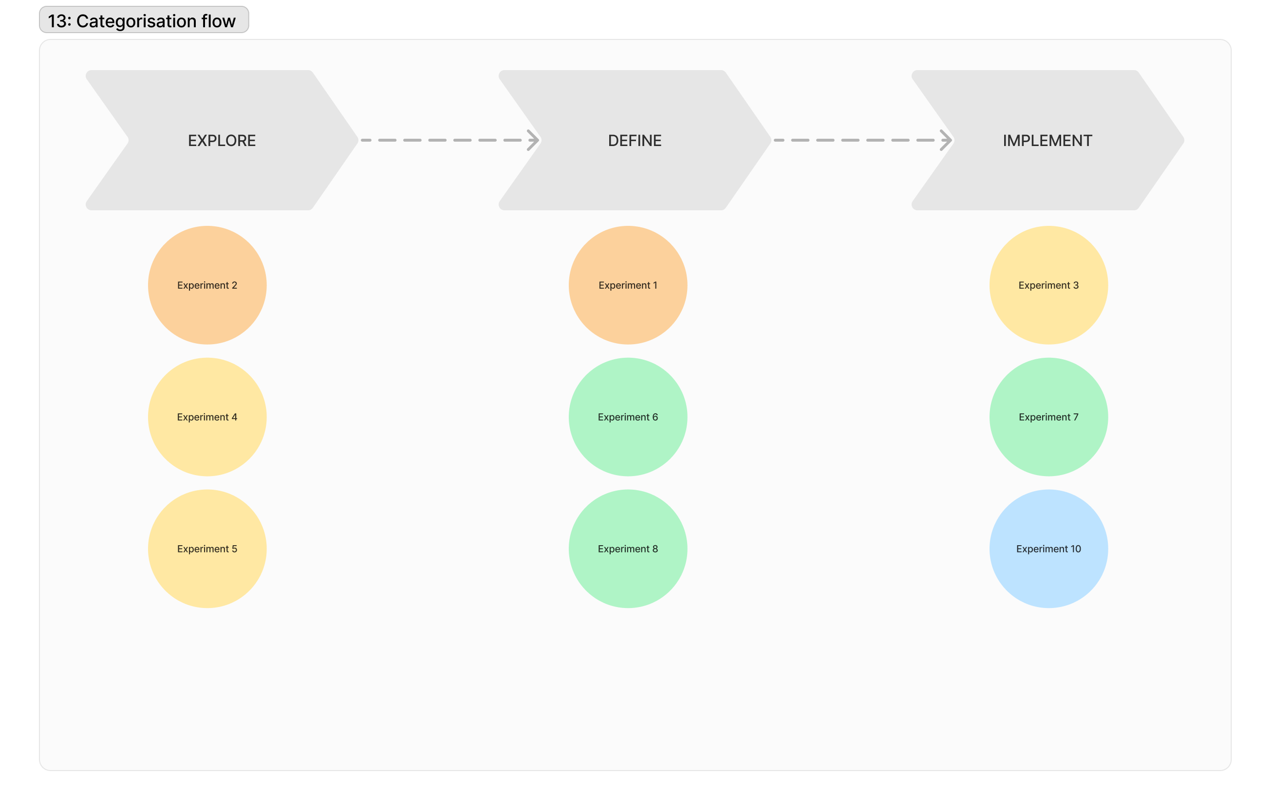
13: Categorisation Flow / Process
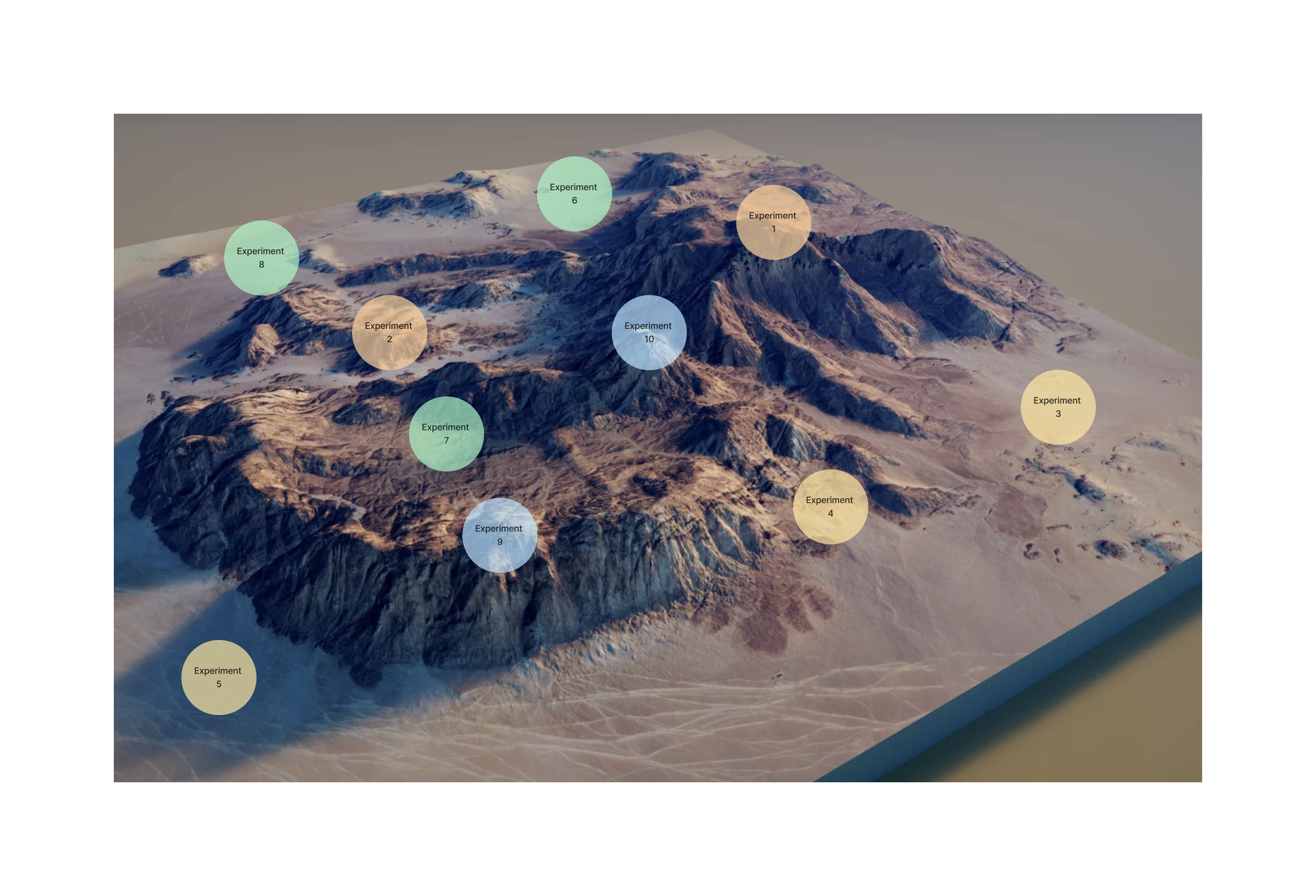
14: Intervention Landscape / Terrain
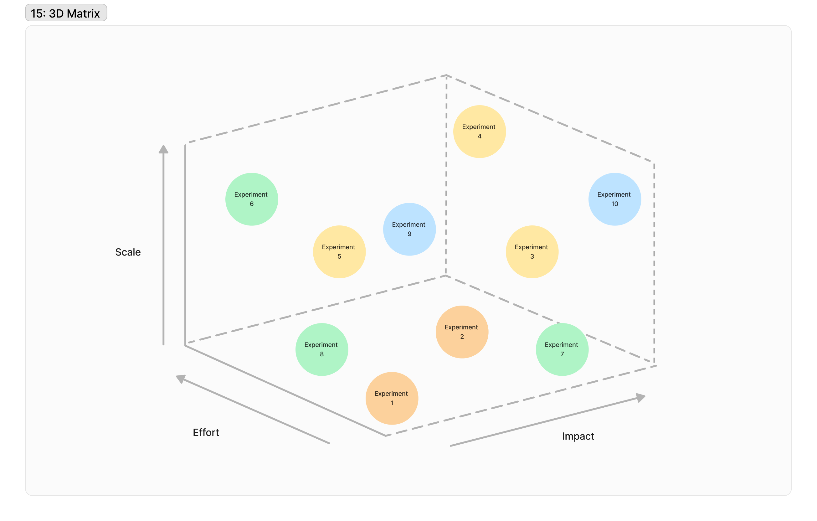
15: 3D Matrix
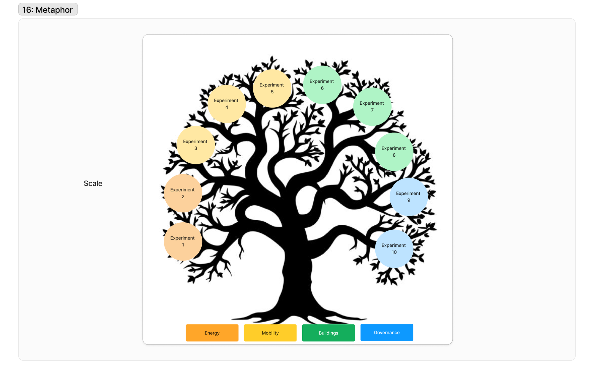
16: Metaphor
Tools
I decided to add this section as a short guide for a few tools I've tried and used, for a couple of the core aspects of operationalising an experimentation portfolio.
Visualisation and presentation
How do we effectively share the parts, the whole, the logic and the interconnections of the portfolio to interested parties?
Flourish Studio - a pretty remarkable simple to use data visualisation and storytelling tool, which can be used to visualise varied data - including a portfolio of experiments.
Kumu - relationship mapping done well. I've been using and sharing Kumu for about a decade now, and I've used it for everything from participatory stakeholder mapping, to system mapping, to a quick and dirty map of what's happening in a place. The hidden gem is the Presentation mode which not enough people know about, which should be used more when bringing people into the story behind the map.
Portfolio Management
How do we document, track and share progress of an experiment portfolio?
Trello / ClickUp / Monday / Asana - basically any project management tool can be repurposed to track experiments, visualise their statuses, etc. The main challenge with these is that they tend to be organisation-specific, and thus don't suit the need for portfolios which exist between organisations and individuals, without paying large sums.
Airfocus / Aha / Roadmunk / Craft - the other category of existing products which stradle the doing and the sharing, are Product Roadmapping / Product Portfolio / Product Feedback platforms like these. They have plenty of potential, and are built for this kind of purpose, but again suffer from the organisational lock-in.
Strategyzer Platform - having seen the inside, there's one module which seems to do the experiment tracking really well, but it's within a much bigger suite of entrepreneurial training content, so unless you're working in this space, I don't think this would work unless they break it out. It reminds me a bit of what LeanStack used to do with their 'continuous innovation' platform, but again - this has pivoted to a training platform primarily. [HT Pete Cohen - thank you for sharing!]
Knowledge Management & Insights
How do we capture and document knowledge associated with an experiment portfolio?
Dovetail - an excellent tool, especially targeted towards qualitative research, with the ability to upload photos, videos, get transcripts and more. Doesn't have quantitative tools, but does have Insights hub which can draw together highlighted copy from a range of research sources.
Gitbook - a more traditional knowledge management or documentation hub, which could serve as a place to capture key insights and share openly.
Rise of the AI Tools - as UNDP pointed to in 2021 - the AI revolution might be a significant player to support portfolio sensemaking, this space is getting busy with the likes of neo4j (genAI x knowledge graphs), Patternz (people matching), Shelf & Tettra (GenAI Q&A with your knowledgebase).
Hybrid
How do we do it all for our experiment portfolio?
Of course, it's going to be hard to have one app to rule them all, but perhaps the closest we come to a core, flexible tool to deliver on a number of needs, are these hybrid platforms.
Airtable - a spreadsheet on steroids, married to a shapeshifter. Airtable is a pretty remarkable tool which is primarily database-driven, but with the ease of inputting information into spreadsheets. It can also use those databases to drive visualisations like maps, gallery views, graphs, flowcharts and more. It also has the ability to create web-based forms so people can submit and alter information in the database.
Notion - the smartest document you'll ever meet. Where airtable focuses on the spreadsheet/database, Notion focuses on the very familiar document format, but then extends this to simple project management, calendar, wikis, simple tables, tags and more. They also have integrations with data visualisers.
Google Workspace - one option is always what's at hand, and for many of us it's Google's suite of documents, spreadsheets, storage, and slides. It can take you a long way, and it has a range of
Something new (?) - whilst all of these options seem to solve parts of the challenge, it's got me thinking about whether there's need for something a little more specialised? Is anyone out there working on something for portfolios in the Living Labs, Missions, Challenge Precincts, Deep Demonstrations space or the likes?
Integrations - both Airtable and Notion play nice with the likes of Zapier, which extends the possibilities of these tools.
Wrap Up
I can't believe you made it down here! But if you did, I suspect you've been thinking about this too - so I'd love to hear from you here (you can leave a comment if you're a free member) or on Linkedin.
What did I miss? What are your burning questions?
How are you going about managing and communicating your experimentation portfolios?
What's next?
Well I aim to have some discussions with folks who are much wiser than me about data visualisation and visual communication, and also have a few discussions with people who are deep in the thick of operating portfolios.
If either of those categories is you and you're interested, send me a note!
I might do a follow up post with a crowdsourced array of exemplar visualisations, so please let me know where you've seen this done well.